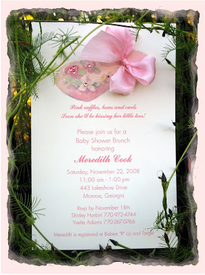
I purchased the invitation at Hallmark and my friend Casey said all the girls are printing their invitations like this now. They have the main information in just a plain font and the rest in a fancy font. I really could not make up my mind in the store, so I went with what everyone else is doing.
What do you think ~ Do you like the different fonts or not?
Also, I had to add a little bling to it by adding the little jewels to the shoes!
A little hint for making a perfect cut on the ribbon ends~
Use a rotary cutter and small mat! Perfect cut every time!


4 comments:
I do like the different fonts on the invitation. Makes it more fun to read. Your little extra touch just made it ;)
I like the different fonts. You did a great job and I love the extra's you added. Oh I wish we lived closer!
I LOVE the use of the different fonts and the invitation turned out just BEAUTIFUL!! Having been a graphic designer for years this is something I did all the time Yvette as it added interest to the design! I hope you have a wonderful week ~ xxoo, Dawn
Looks wonderful!
You did such a great job. :)
I love the extra "bling bling" ;)
Post a Comment